Privacy: Settings
The settings interface of the Privacy module can be accessed from the Privacy tab at menu Window > Easy Mobile > Settings.
App Tracking Transparency
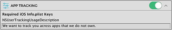
To use the App Tracking sub-module you must first enable it. In the Privacy module settings, click the toggle of the APP TRACKING section to enable and start configuring the sub-module.
Required iOS Info.plist Keys
For this sub-module to function on iOS, the NSUserTrackingUsageDescription key must be added into the Info.plist file of your Xcode project. Failure to do so will cause the app to crash when using the App Tracking Transparency API. Simply enter a suitable description for your app in the provided textfield, Easy Mobile will automatically add this key and the associated description into the Info.plist file of the exported Xcode project for you. Headsup: no matter what description you provide, the users will probably feel skeptical.
As of now the App Tracking Transparency sub-module only supports iOS. When Android comes up with a similar API it will certainly be supported, as Easy Mobile is about cross-platform features that function on both iOS and Android.
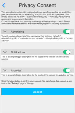
Default Consent Dialog Composer
There are two ways to construct an Easy Mobile consent dialog: building it in script or using the built-in graphical consent dialog composer. The latter can be found in the Privacy module settings interface. The dialog composed with this composer is the default consent dialog and can be obtained from script using the Privacy.GetDefaultConsentDialog() method (see Working with Default Consent Dialog).
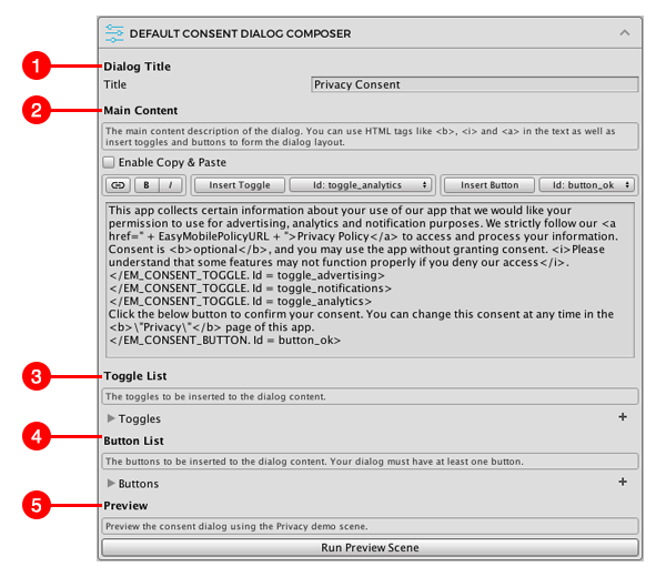
The composer consists of following sections:
- Title: for editing the dialog's title
- Main Content: this is where you compose the main content of the dialog by inserting texts, toggles or buttons.
- Toogle List: this is where you manage the toggles in your dialog, adding or removing toggles, setting their parameters such as ID, title, description, etc.
- Button List: this is where you manage the buttons in your dialog, adding or removing buttons, setting their parameters such as ID, label, colors, etc.
- Preview: you can use the button in this section to open the preview scene for the composed dialog.
Composing Main Content
You can edit the body of your consent dialog in the Main Content section of the composer.
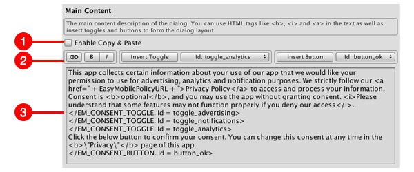
- Enable Copy & Paste: in some versions of Unity we can't have both text selection function (for styling or inserting hyperlinks) and copy-paste function at the same time. In such case you can check this option when you want to do copy-paste and uncheck it to use the toolbar buttons (which require text selection).
- Toolbar: containing buttons for text styling (bold, italic), inserting hyperlinks, inserting toggles and buttons.
- Text Area: for inputing the text that describes the content of your consent dialog.
Text Styling
Common HTML tags including <b> (bold) and <i> (italic) can be used to style the text. In the composer you can select a chunk of text and use the B or I button on the toolbar to make it bold or italic respectively, the appropriate tag will be added to the text in the below text area automatically.

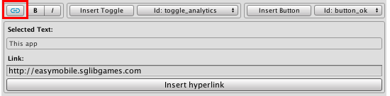
Inserting Hyperlinks
It's important to provide links to appropriate privacy policy in the consent dialog, which can be done by inserting hyperlinks. To insert a hyperlink, simply select the appropriate text in the text area and click the hyperlink button on the toolbar and enter the appropriate URL.
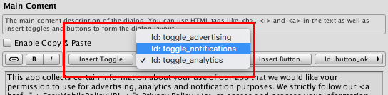
Inserting Toggles
Before inserting toggles to the consent dialog, you must create them in the Toggle List section first (see Managing Toggles). Then select the toggle to insert using its ID in the toggle dropdown on the toolbar and click the Insert Toggle button. A special toggle tag (e.g. </EM_CONSENT_TOGGLE. Id = toggle_advertising>) will be inserted at the current cursor position in the text area. In runtime, this will be replaced by an actual toggle constructed with the parameters corresponding to the toggle ID in the toggle list.
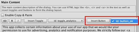
Inserting Buttons
Before inserting buttons to the consent dialog, you must create them in the Button List section first (see Managing Buttons). Then select the button to insert using its ID in the button dropdown on the toolbar and click the Insert Button button. A special button tag (e.g. </EM_CONSENT_BUTTON. Id = button_ok>) will be inserted at the current cursor position in the text area. In runtime, this will be replaced by an actual button constructed with the parameters corresponding to the button ID in the button list.
Your consent dialog must have at least one button so that it can be close with the Completed event.
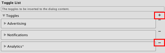
Managing Toggles
Toggles in your consent dialog can be designed and managed in the Toggle List section. To create a new toggle click the plus button at the top right corner. To remove a toggle click the minus button to the right of that toggle.
The following shows the parameters of a toggle.
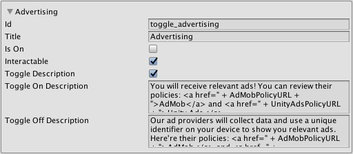
- Id: the ID of the toggle.
- Title: the title of the toggle.
- Is On: whether the toggle should be turned on by default.
- Interactable: whether the toggle is clickable, this value can be changed from script in runtime.
- Toggle Description: whether the description should be updated according to the on off state of the toggle, if this value is false, the Toggle On Description will always show.
- Toggle On Description: the description to be shown when the toggle is on, or when Toggle Description is false.
- Toggle Off Description: the description to be shown when the toggle is off and Toggle Description is true.
Similar to the main body text, you can use common HTML tags such as <b>, <i> and <a> in the Toggle On Description and Toggle Off Description.
Managing Buttons
Buttons in your consent dialog can be designed and managed in the Button List section. To create a new button click the plus button at the top right corner. To remove a button click the minus button to the right of that button.
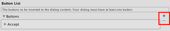
Again, you consent dialog must have at least one button so the last one won't be removable.
The following shows the parameters of a button.
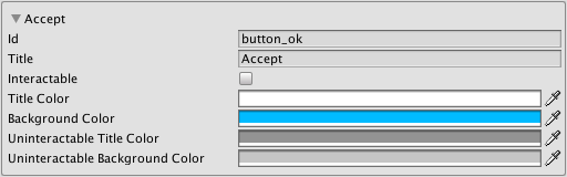
- Id: the ID of the button.
- Title: the text on the button
- Interactable: whether the button is clickable, this value can be changed from script in runtime.
- Title Color: the color of the button text in normal state (clickable).
- Background Color: the color of the button body in normal state (clickable).
- Uninteractable Title Color: the color of the button text when it is not clickable.
- Uninteractable Background Color: the color of the button body when it is not clickable.
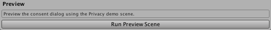
Previewing Consent Dialog
You can preview the consent dialog while composing it without having to export a build to a mobile device. In the Preview section click the Run Preview Scene button to run the Privacy Demo scene.
In the opened scene click the DEFAULT CONSENT DIALOG button to open the default consent dialog which has just been composed. The consent dialog in the editor looks and functions similarly to its counterparts on iOS or Android and is useful for quick verifying of your dialog design.